


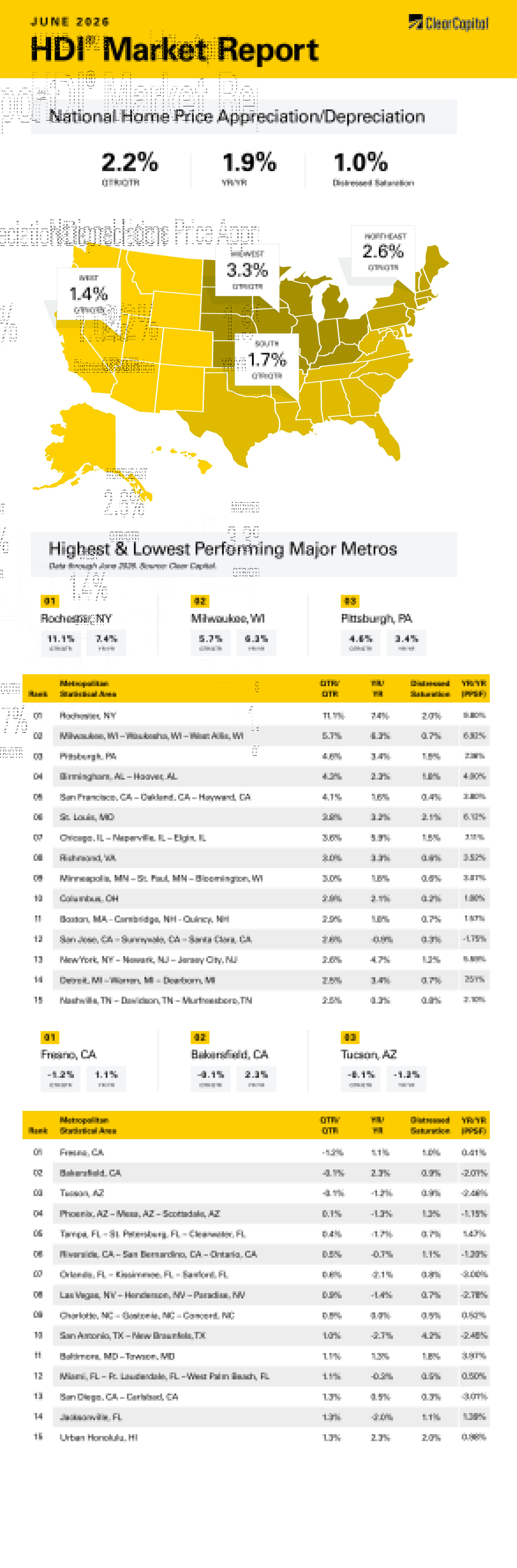
The June 2026 Clear Capital Home Data Index (HDI®) Market Report shows national quarter-over-quarter home price growth is at 2.2 percent.
Download the report, or read it below.
Commentary by Brent Nyitray of The Daily Tearsheet
Home price appreciation accelerated in June, according to the Clear Capital Home Data Index. Nationally, home prices rose 2.2% on a quarterly basis and 1.9% annually after rising 1.3% quarterly in May. Every region improved on a quarterly and annual basis. After a period of tepid, barely positive growth, home prices are perking up.
The Midwest took the top spot, with prices rising 3.3% quarterly and 4.0% annually. Milwaukee, WI showed impressive growth, rising 5.7% quarterly and 6.3% annually. Chicago rose 3.6% quarterly and 5.9% annually, while St. Louis, MO rose 3.8% quarterly and 3.2% annually. Six of the top 15 metro areas were in the Midwest last month.
The Northeast was demoted to second place, rising 2.6% quarterly and 4.4% annually. The top Northeastern metropolitan statistical area (MSA) was Rochester, NY, where prices grew 11.1% on a quarterly basis and 7.4% annually. Rochester has exhibited unusual volatility compared to most MSAs, finding itself leading the pack one quarter and then showing up in the basement the next. In Boston, prices rose 2.6% on a quarterly basis and 1.8% annually.
The South came in third, where prices rose 1.7% on a quarterly basis and 0.4% on an annual basis. Birmingham, AL was the leader where prices rose 4.3% on a quarterly basis and 2.3% annually. Richmond, VA was in the top 15, where prices rose 3.0% on a quarter-over-quarter (QoQ) basis and 3.3% annually. Florida continues to struggle, with four MSAs in the bottom 15: Tampa prices rose 0.4% quarterly and fell 1.7% annually. Jacksonville, Miami, and Orlando MSAs also landed in the bottom 15.
The West came in last, where prices rose 1.4% on a quarterly basis and 0.1% annually. The top Western MSA was San Francisco, where prices rose 4.1% quarterly and 1.6% annually. San Jose, CA was also in the top 15, with prices increasing 2.6% quarterly and down 0.9% annually. The worst performing western MSA was Fresno, CA where prices fell 1.2% on a quarterly basis but rose 1.1% on an annual basis. Phoenix, AZ saw prices rise 0.1% quarterly and fall 1.3% on a year-over-year (YoY) basis.
Housing affordability is a hot button issue these days, and it seems that there is no shortage of ink spilled on the topic. Millennial home buyers are said to be priced out of the housing market and house prices relative to incomes are close to all-time highs. Housing affordability has helped drive the campaigns of socialist candidates in big cities who promise rent control. Social media campaigns tell Millennials that their parents (the baby boomers) were buying houses for a pittance and never had to struggle with affordability. The chattering classes are concentrated on the coasts, which are the least affordable areas, and this fact helps drive the narrative. There is a kernel of truth to the generational comparison, but the difficulty facing the Millennials is somewhat overstated.
There are a few different metrics to measure affordability. The most common is to compare the median house price to median income and track that ratio over time. It makes intuitive sense and is easy to calculate. This metric is typically cited by the press, and it supports the narrative that we have a big affordability problem. Indeed, if you look at the ratio of the median home price to median income over time, it certainly appears to support that assertion.
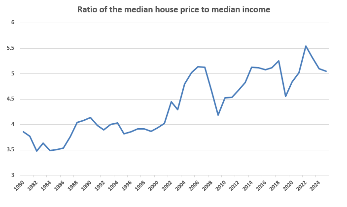
That said, this ratio is misleading. If you look at this graph, it suggests that 1982 was a great time to buy. In 1982, the median home price was a measly $66,400 and the median income was $19,704. With a median house price to median income ratio of 3.5, the boomers would seem to have it way easier than their progeny, who are paying over 5 times.
For those old enough to remember, 1982 was not a great time economically. The 1981-1982 recession was the deepest since the Great Depression, as Paul Volcker jacked up interest rates to defeat 1970s inflation. The unemployment rate topped 10% in the latter half of the year. The state of the economy was characterized by the misery index, which is the sum of inflation and unemployment.
The problem with the median home price / median income analysis is that it ignores the effect of interest rates. Affordability is more a function of the monthly payments not the value of the asset. This is where interest rates come into play, and it turns the median house price/median income analysis on its head.
Below, I plotted the monthly principal and interest payment for the median home with a 20% down payment and divided that payment by median monthly income. Using that analysis, 1982 wasn’t the most affordable year for housing, it was the worst!
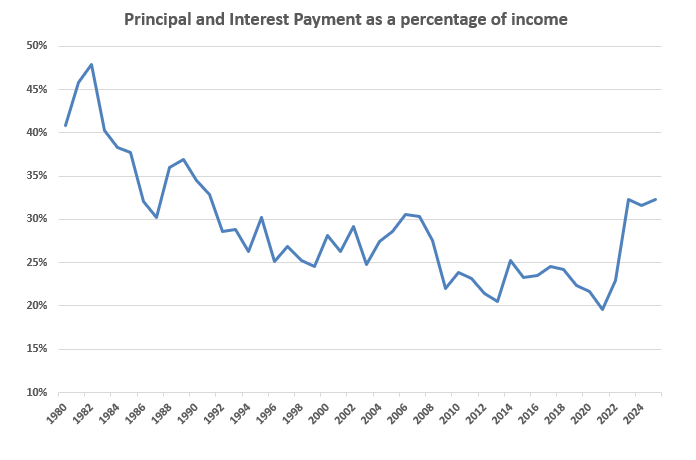
Sure, the median house price was $66,400 and the median income was $19,704, but the mortgage rate was a whopping 17%. The principal and interest payment consumed 48% of monthly income, and that is before property taxes and homeowner’s insurance costs. By this analysis, the current state of affordability is stretched compared to the post-bubble years but isn’t terrible compared to a longer historical perspective. Note that the median household income in 2025 was 83,780 and early estimates for 2026 are coming in between 88,000 and 90,000. If that turns out to be accurate, the ratio will dip back below 30%, where it was during the 1990s. Affordability is still a problem, but it is hardly at unprecedented levels.
Meanwhile, inflation-adjusted home prices continue to fall, as home price appreciation lags inflation. Incomes continue to rise and may accelerate this year. The one dark spot is that homeowners’ insurance is rising faster than inflation and HOA fees are being hiked due to deferred maintenance. We probably will see higher property taxes going forward as well, however that is a local issue. But unless we see another spike in real estate prices, the worst of the affordability crisis is probably behind us.
About the Clear Capital Home Data Index (HDI®) Market Report and Forecast
The Clear Capital HDI Market Report and Forecast provides insights into market trends and other leading indices for the real estate market at the national and local levels. A critical difference in the value of Clear Capital’s HDI Market Report and Forecast is the capability to provide more timely and granular reporting than nearly any other home price index provider.
Clear Capital’s HDI Methodology
• Generates the timeliest indices in patent pending, rolling quarter intervals that compare the most recent four months to the previous three months. The rolling quarters have no fixed start date and can be used to generate indices as data flows in, significantly reducing multi-month lag time that may be experienced with other indices.
• Includes both fair market and institutional (real estate owned) transactions, giving equal weight to all market transactions and identifying price tiers at a market specific level. By giving equal weight to all transactions, the HDI is truly representative of each unique market.
• Results from an address-level cascade create an index with the most granular, statistically significant market area available.
• Provides weighted repeat sales and price-per-square-foot index models that use multiple sale types, including single-family homes, multi-family homes and condominiums.
The information contained in this report and forecast is based on sources that are deemed to be reliable; however, no representation or warranty is made as to the accuracy, completeness, or fitness for any particular purpose of any information contained herein. This report is not intended as investment advice, and should not be viewed as any guarantee of value, condition, or other attribute.